Assignment time! This is a look into redesigning or designing our personal branding. I have had some previous experience in this field so I would like to take you quickly through that.
![]()
This is my current logo I designed it almost 2 years ago and had a revision of it a year ago while I love it and it has a special place in my heart its time for a change.
![]()
When I revisited the logo I didn’t change much just updated the colors to fit more with pastel aesthetic. I have a collection of my original ideas and sketches for this logo here.
from the logo, I also have a designed letterhead and business card
While these are still nice and I enjoy there design my overall taste has changed and I would like my new logo and branding to reflect that fact. So starting from now I will be looking into other logos I like and think of new ideas for my new logo.


Here are some logos I love these are from Japnese fashion brands. I love this style of logo Its really nice to see so many colourful well-designed logos with some background into these finished I decided to start sketching some logos up.

I really wanted to incorporate two things into my logo, stars, and clouds along with having a pastel color palette.

I then drew up my design in photoshop to get a feel for them and see which one I really liked. Out of all of them, my favorite was the cloud design.
![]()
I liked the shape of this one but I felt is could be improved so I decided to just redo it to see could I like it more.
![]()
So I retraced it and felt there was something missing it felt to plain to me like it was missing something still. I wanted to include a star in my logo so I decided to try and work one in there.
![]()
This design I liked more but felt it was to awkward it seemed to slap together didn’t quite capture what I wanted my logo to be so I just felt it need to be redesigned more in dept if I was gonna get this logo right.

I started off with coming up with a better cloud shape something simpler easier to draw.

After finding a cloud shape I like I started to figure out how the star would come in and how it would work.
I then drew this up in photoshop I like the shape much more and the star looked much better but my color felt a bit off I wanted to use mainly blue and yellow in my design but it wasn’t looking how I wanted it to look.
![]()
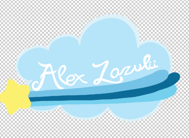
So I then added two more colors to the mix by putting and pink and a green this improved the logo I feel made it so much brighter and really brought out the colours so much more. But it still felt really unfinished to me my “Alex Lazulii” Lettering was just not working anymore I felt it needed a change and uplift so once again I redid it.
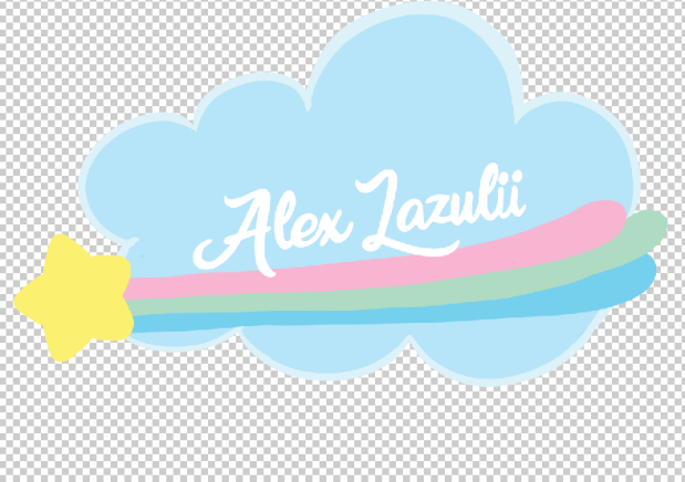
I looked at a few different fonts to see how they were drawn to get a better shape and line weight and I think it worked out so much better this lettering really works out so much better it really ties the logo together, even more, it looks finished now it looks professional to me. But cause I can’t leave anything alone I decided to give the logo one more step up.
![]()
And with that my final logo is complete I added some extra starts to give it my flare and I think to work well to break up the white space and I am really happy with this redesign.


